
Using a new tool designed by MIT scientists, If will be possible to explore the many compromises that come with designing new products with efficiency. The tool lets users interactively explore all designs that best-fit multiple, often-conflicting performance tradeoffs in real time.
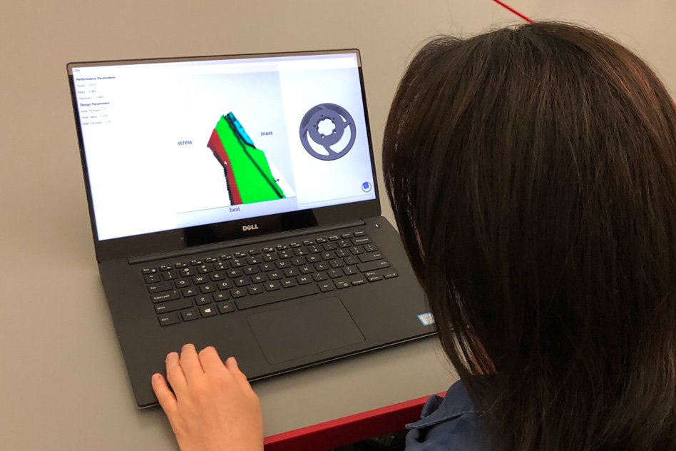
This visualization tool for CAD primarily calculates optimal designs for three performance objectives in a precomputation step. It then maps every one of those outlines as color-coded patches on a triangular graph. Clients can move a cursor in and around the patches to organize some execution objectives. As the cursor moves, 3-D outlines create the impression that is advanced for that correct spot on the diagram.
Adriana Schulz, a CSAIL postdoc and first author of the paper, said, “Now you can explore the landscape of multiple performance compromises efficiently and interactively, which is something that didn’t exist before.”
Schulz, Matusik, and Grinspun, said, “Using this new tool, we can directly edit the performance space and provide real-time feedback on the designs that give you the best performance. A product may have 100 design parameters … but we only care about how it behaves in the physical world.”
Courtesy of the researchers
In the new paper, the researchers home in on a critical aspect of performance called the “Pareto front,” a set of designs optimized for all given performance objectives, where any design change that improves one objective worsens another.
This font is usually represented in CAD and other software as a point cloud (dozens or hundreds of dots in a multi-dimensional graph), where each point is a separate design. For instance, one point may represent a wrench optimized for greater torque and less mass, while a nearby point will represent a design with slightly less torque but more mass.
Specialists difficulty alter outlines in CAD to discover these Pareto-optimized plans, utilizing considerable mystery. At that point, they utilize the front’s visual representation as a rule to discover an item that meets a particular execution, thinking about the different compromises.
The tool speedily discovers the entire Pareto front and turns it into an interactive map. The model first quickly uncovers one design on the Pareto front. Then, it uses approximation calculations to discover tiny variations in that design.
After doing that a few times, it captures all designs on the Pareto front. Those designs are mapped as colored patches on a triangular graph, where each patch represents one Pareto-optimal design, surrounded by its slight variations. Each edge of the graph is labeled with a separate performance objective based on the input data.
Co-authors on the paper are Harrison Wang, a graduate student in mechanical engineering; Eitan Grinspun, an associate professor of computer science at Columbia University; Justin Solomon, an assistant professor in electrical engineering and computer science; and Wojciech Matusik, an associate professor in electrical engineering and computer science.