Gravity is the attractive pull between two objects that have mass. The larger the mass of the object, the greater the strength of gravity. In terms of mass, Earth is also a pretty big customer. But, its mass is not evenly distributed and also changes over time.
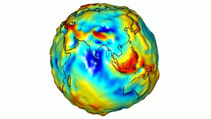
Recently, NASA shared visualization of how gravity varies across our planet Earth. A few years ago, using data from NASA’s Gravity Recovery and Climate Experiment (GRACE), NASA scientists have created a visualization of a gravity model that shows variations in Earth’s gravity field.
The colors in this image represent the gravity anomalies measured by GRACE. One can define standard gravity as the value of gravity for a perfectly smooth ‘idealized’ Earth, and the gravity ‘anomaly’ measures how actual gravity deviates from this standard. Red shows the areas where gravity is stronger than the smooth, standard value, and blue reveals areas where gravity is weaker.
Credit: NASA/JPL/University of Texas Center for Space Research
It shows that the areas of the northwest of South America have a higher gravitational pull. On the other hand, the southern region of India tends to have a lower gravitational force. It gradually gets bluer as it reaches the edges. The northern region of India, including the Himalayas, appears red, which means the gravity is stronger in this region.
After more than 15 productive years in orbit, the U.S./German GRACE (Gravity Recovery and Climate Experiment) satellite mission ended science operations in 2017. During their mission, the twin GRACE satellites (GRACE-1 and GRACE-2) have provided unprecedented insights into how our planet is changing by tracking the continuous movement of liquid water, ice, and the solid Earth.
